Network Analysis with R: In an interactive way
Author : Shubhadip Paul, Sr. Data Scientist, TCS Kolkata
Prolouge:
Network
analysis is popular way to visualize the relationship between
different nodal points. For example, the average time required to
travel from warehouse A to destinations X and Y.
We can just say it’s 45 and 65 minutes respectively and that is
perfectly fine. Now imagine a scenario where there are 19 warehouse
and 32 destinations. In that case just representing travel time
between warehouses and destinations in above manner or putting it in
a tabular format may not be sufficient to get the overall picture.
Here the network analysis comes in for help!
In this article I am going to take a very simple example to demonstrate how network analysis works but with an interactive way. Let’s add more fun to the code and interact with it. If this article helps you in any fashion, then my purpose is served!
Requirements:
R
codes in this article are wirtten in two macros, so fair
knowledge about R coding is required to fully understand these codes.
I have only used igraph as an extra package, beside other default packaes, for this network analysis. I would encourage to visit the igraph site for more information.
Required csv file for this article can bedownloaded from here. Please save this file in your local system before proceeding with the code.
Please run all lines together to get the best experience out of it. You can copy and paste the whole code in R platform first and then press ctrl+A and run it. But I will break the code down for your understanding.
Step 1: Save the csv file in your local system/folder
Step 2: Import/install igraph library
install.packages(“igraph”, dependencies = TRUE)
library(igraph)
Step 3: Setting up the working directory and choosing the file
settings <- function(set){
  setwd(winDialogString(“Please enter the directory path and then select the data file (.csv)”,""))
  file.choose()
}
setwd command is to set working
directory.
winDialogString command with generate a window
askig for with the massage "Please enter the directory path and
then select the data file (.csv)" with default value as empty
(double quotes), as mentioned after the comma.
file.choose
command is for choosing style dialog box for file selection. Please
find below the window pop-ups for above code.
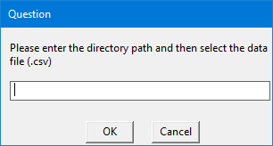
Step 4: Building the network analysis
Below is the code for network analysis. This code can be directly copy-pasted to R. I will explain the code at the bottom of the code.
network <- function(top){
        data <- read.csv(settings())
        len <- length(unique(data$from))
        aggregate(delay ~ from, data, FUN = mean)
        node_size <- data.frame(aggregate(delay ~ from, data, FUN = mean))
        net <- graph_from_data_frame(d = data, directed = TRUE)
        E(net)$width <- 1+E(net)$delay/20
        high <- E(net)$width[order(-E(net)$width)]
        top <- winDialogString("How many top values you want to highlight?", "")
        top <- as.integer(top)
        top_val <- if (high[top]>high[top+1]) {high[top]
        }  else {high[top+1]
        }
        top_col <- which(E(net)$width >= top_val)
        E(net)$color <- "gray"
        E(net)$color[top_col] <- "red"
        V(net)$color <- "orange"
        V(net)$color[1:len] <- "skyblue"
        V(net)$size <- 10
        V(net)$size[1:len] <- c(node_size$delay)
        set.seed(10)
        plot(net, edge.arrow.size = 0.4, vertex.color = V(net)$color, vertex.size = V(net)$size, layout = layout.circle, main = "Network Diagram")
        if (winDialog("yesno", "Want to save as pdf?") == "YES") {pdf(winDialogString("File name?", ".pdf"))
        plot(net, edge.arrow.size = 0.4, vertex.color = V(net)$color, vertex.size = V(net)$size, layout = layout.circle, main = "Network Diagram")
        dev.off()
        }
    }
Let’s break down the code! As you can see first I have defined a function named ‘network’ with variable input called ‘top’. Next I have imported the csv file and determined its unique ‘origins’. This is designated as ‘data$from’ from the csv file.
Next with the ‘aggregate’ function, mean value of corresponding origin and destination has been calculated. This is translated to node size in next step.
E(net)$width determines the thickness of arrows in the diagram. You can regulate he thickness by the denominator (in this case I have put it as 20).
A variable called ‘high’ is defined to identify the top delay values. The number of top values will be determined by your input in the pop-up box like below.
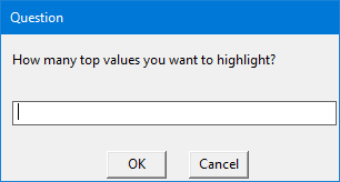
Please note that the number ‘top’ values should be greater than 0 and less than or equal to origin-destination combinations (in this case, 13). But top 3 or 5 values should be prefect to highlight.
In next couple of lines top values, respective arrow widths and node size values are determined, based on your input in the window pop-up box.
In the above code I have set a seed value of 10 with set.seed(10) for a particular layout of the network diagram. But feel free to change it as per your requirements.
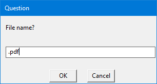
In ‘plot’ command, various aesthetic parameters are specified with an option to save the network diagram in PDF file in the same directory specified at the beginning of the analysis. There will be a window pop-up asking if you want to save a PDF version of the network diagram or not. If you select ‘yes’, then it will ask you for a file name. Please keep the ‘.pdf’ extension at the end of the file name or else the file won’t save in correct format. The corresponding screenshots are below.

Step 5: Trigger of the analysis
Now we are all set to fire the code with a last component, trigger. The below code run the whole code in step-by-step manner.
if(winDialog("yesno", "Do you want to start Network Analysis?") == "YES") {
    if(winDialog("okcancel", "Is your data file (.csv) is ready and placed in the directory?") == "OK"){
        network()}
    }
Let me explain why this is at end of the code and not in the beginning. As you can see, first decision is whether you want to run the code or not. It’s a check in case you have run the code by accident.
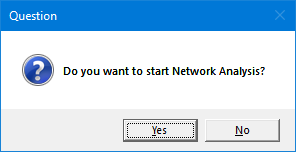
Once you select ‘yes’, it will ask if you have kept the csv file in desired directory or not. This is another check to ensure that you have kept the file in proper directory.
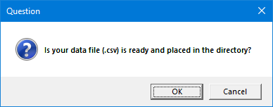
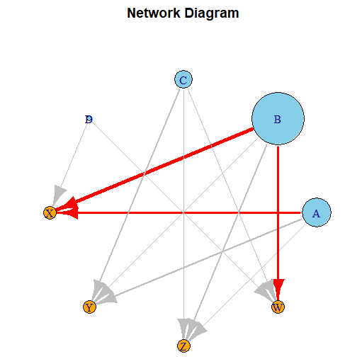
Once you click ‘OK’ it will ask for the directory path as mentioned in Step 3. As you can see the ‘network’ macro will run only if you click ‘OK’ and hens the reason this code is at the end. Unless we define the ‘network’ macro beforehand, these commands are meaningless. Here is the network diagram for top 3 values
Step 6: Interpretation of the analysis
Let's interpret the above diagram. Sky blue bubbles are origins (from column) and oranges are destinations (to column). The size of origin bubbles are determined by the amount of delay from that particular origin. In this case B has the highest amount of delay. The thickness of the arrow is determined by the amount of delay between that particular origin and destination. In this case I have considered top 3 delays. B to X has the highest amount of delay, 80 units. Both A to X & B to W have same amount of delay, 40 units. But they are highlighted as they have different origin-destination combination. I kept second and third highest value same (40) to demonstrate how the network diagrams behave when two values are same. I strongly encourage you to change the top values and observe how the diagram behave.
Please find below the full code for your convenience. As requested before, please run all the lines at once to get the maximum fun out of it. Yes, running a code is always fun and seeing it to produce a desired output is always a pleasure!
settings <- function(set){
  setwd(winDialogString(“Please enter the directory path and then select the data file (.csv)”,""))
  file.choose()
}
network <- function(top){
  data <- read.csv(settings())
  len <- length(unique(data$from))
  aggregate(delay ~ from, data, FUN = mean)
  node_size <- data.frame(aggregate(delay ~ from, data, FUN = mean))
  net <- graph_from_data_frame(d = data, directed = TRUE)
  E(net)$width <- 1+E(net)$delay/20
  high <- E(net)$width[order(-E(net)$width)]
  top <- winDialogString("How many top values you want to highlight?", "")
  top <- as.integer(top)
  top_val <- if (high[top]>high[top+1]) {high[top]
  }  else {high[top+1]
  }
  top_col <- which(E(net)$width >= top_val)
  E(net)$color <- "gray"
  E(net)$color[top_col] <- "red"
  V(net)$color <- "orange"
  V(net)$color[1:len] <- "skyblue"
  V(net)$size <- 10
  V(net)$size[1:len] <- c(node_size$delay)
  set.seed(10)
  plot(net, edge.arrow.size = 0.4, vertex.color = V(net)$color,
  vertex.size = V(net)$size, layout = layout.circle, main = "Network Diagram")
  if (winDialog("yesno", "Want to save as pdf?") == "YES")
    {pdf(winDialogString("File name?", ".pdf"))
    plot(net, edge.arrow.size = 0.4, vertex.color = V(net)$color,
    vertex.size = V(net)$size, layout = layout.circle, main = "Network Diagram")
    dev.off()
  }
}
if(winDialog("yesno", "Do you want to start Network Analysis?") == "YES") {
  if(winDialog("okcancel", "Is your data file (.csv) is ready and placed in the directory?") == "OK"){
    network()}
}